After working at two large corporations, taking one startup from 0 to 1, and joining another in its early stage, I’m ready to start my own venture. The product ideas I keep returning to aren’t just fleeting thoughts. They’re opportunities I’ve rigorously questioned, refined, and sharpened over time. As my focus has clarified, the tech landscape has evolved, and my experience has grown, these ideas have taken shape into something meaningful and ready to build.
I’ll be sharing them here soon. Before unboxing them, I want to reflect on my journey so that both I and anyone visiting this page can see how my upcoming work naturally follows the story of my growth in tech.
One for One Billion
Gmail, Google apps 2012 - 2017
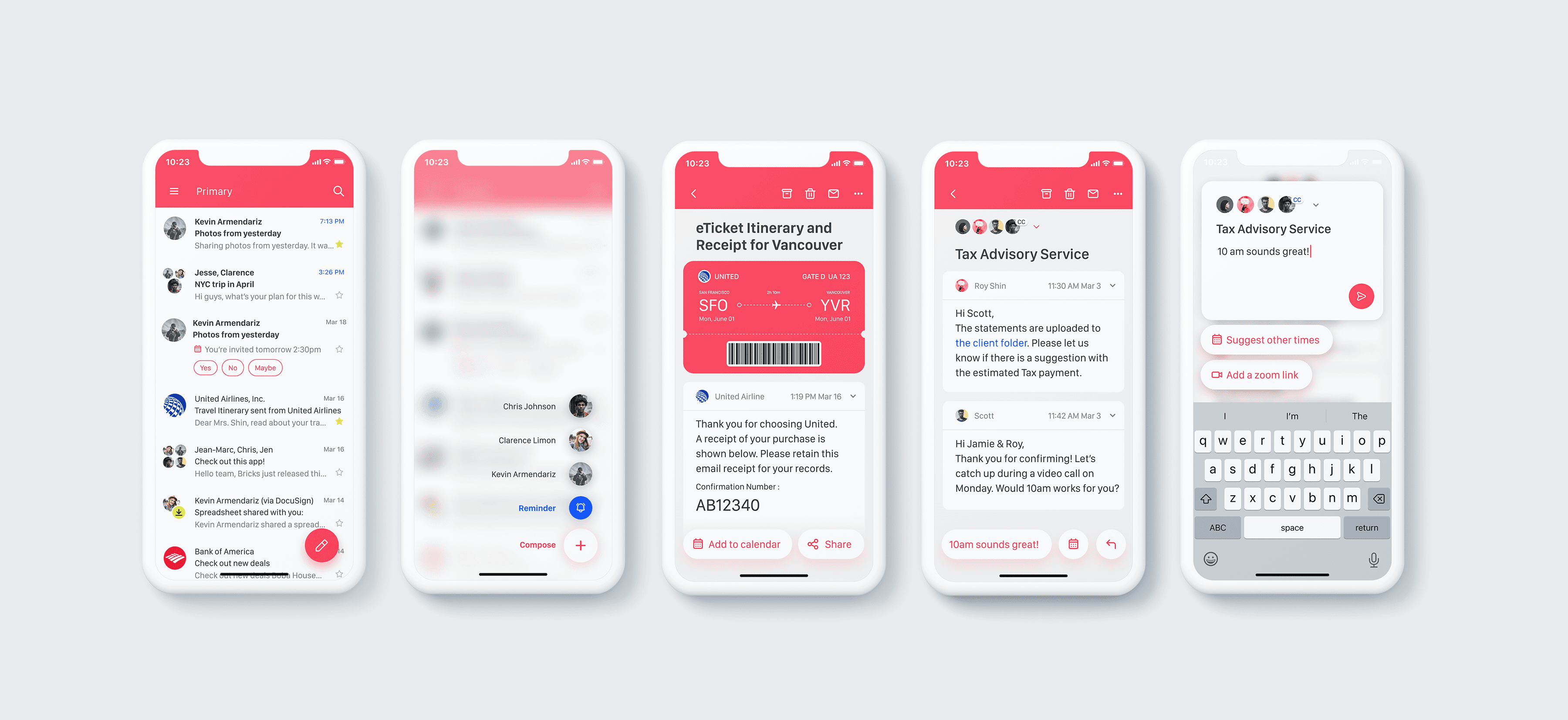
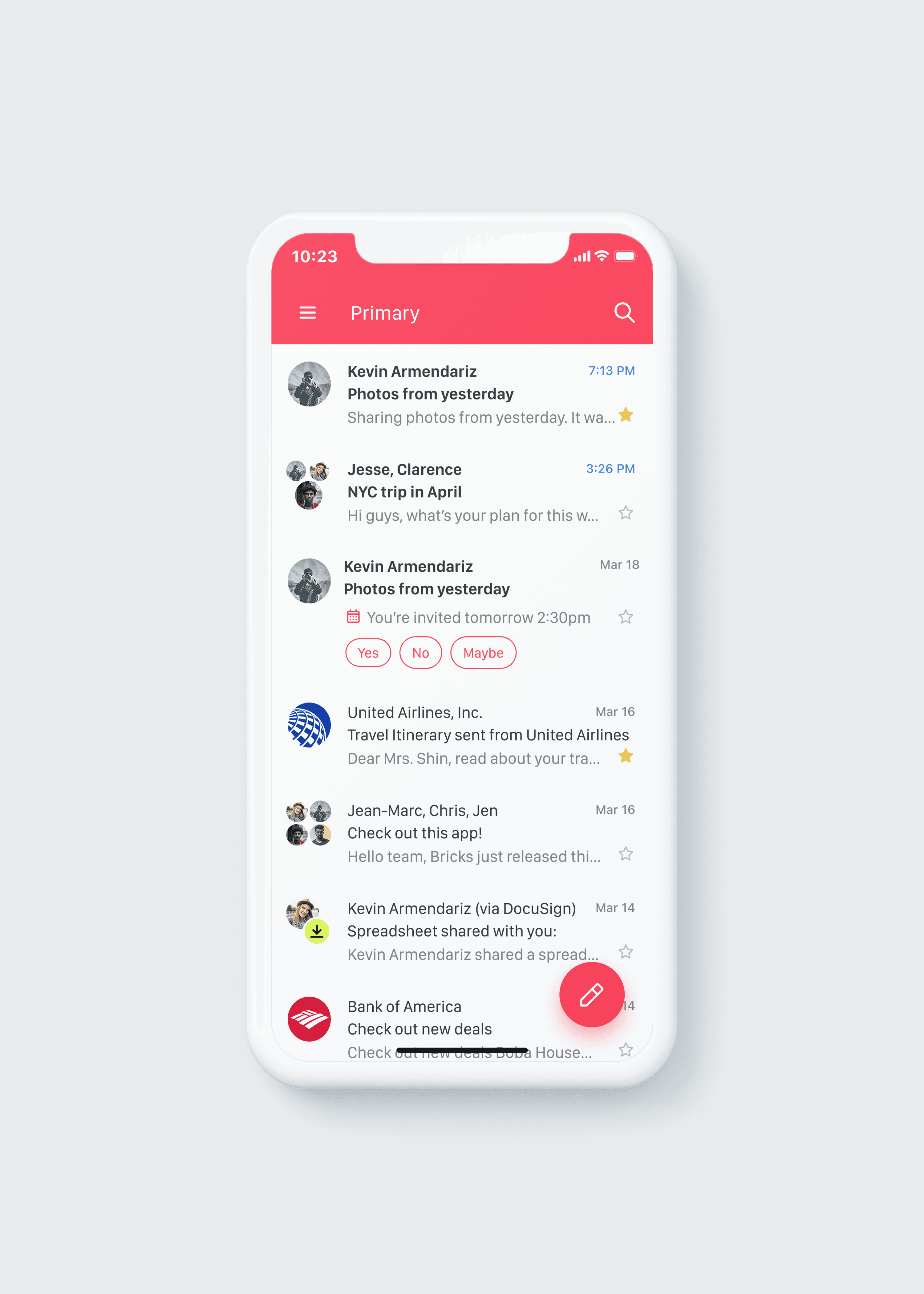
In February 2016, Google announced Gmail had surpassed 1 billion active users. At that time, I was in my third year on the Gmail team. That milestone encapsulates much of my experience working on the product.
Cross-Platform Design & the Material Design System
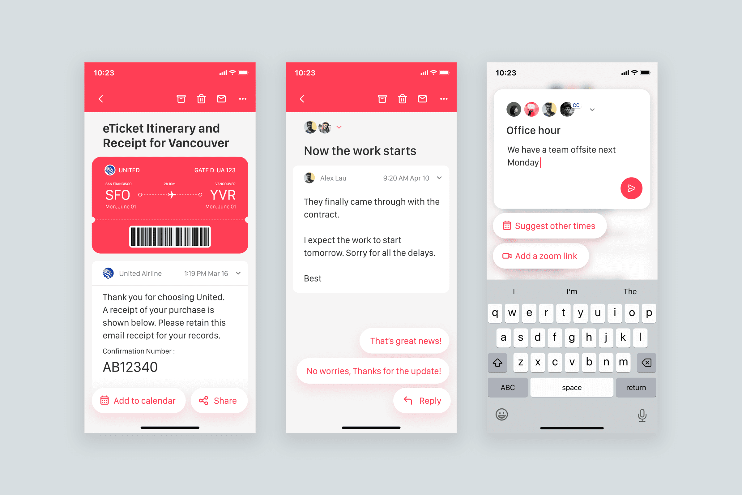
Around this time, Google launched its first company-wide design system, Material Design. It began as a mobile-first initiative aimed at creating consistency across platforms, including desktop. This was an exciting opportunity to rethink the entire Gmail experience, aligning it with evolving user needs and preparing it for emerging platforms like smartwatches and large-format tablets.
With Gmail’s massive user base, even small changes carried risk. To move responsibly, cross-functional teams collaborated closely, using data and feedback to guide decisions.
I worked with the Material Design team to represent Gmail’s needs and help shape Google-wide UI components iterating alongside teams from Android, Maps, and Docs.
What we learned
Bold redesigns can actually ease transitions by signaling clear, intentional change.
Design principles matter most when things get hard - stay anchored in them.
A design system should boost productivity and efficiency, visual polish should never override real user value
Accessibility
Given Gmail’s scale, accessibility was a priority from day one. We ensured all visual elements met WCAG AA standards and didn’t rely on color alone for feedback.
We streamlined the screen reader experience, reducing the 7–8 steps once needed to reach the first email by improving reading order and removing unnecessary elements.
To ensure consistency across Google products, we collaborated with other app and Android teams on shared patterns for navigation and global actions, helping users rely on familiar, accessible behaviors throughout
Email Is Not Dying
Around this time, messaging apps were rapidly gaining popularity. Group chats began replacing email threads, and small businesses found messaging more convenient for customer communication. This raised a big question: Was email becoming obsolete?
The Gmail team saw things differently. While chat apps were fast and convenient, email still had unique strengths. Instead of standing still, the team pushed forward. In 2014, they launched Inbox by Gmail, focused on task management and streamlined reading. In 2017, Smart Reply debuted, using machine learning to suggest quick responses.
AI wasn’t new to Gmail, features like Priority Inbox and spam filters had long used it. But Smart Reply marked a shift: for the first time, Gmail offered proactive, AI-driven help. It opened the door to smarter features like message drafting, scheduling, and contextual suggestions.
Beyond Screen
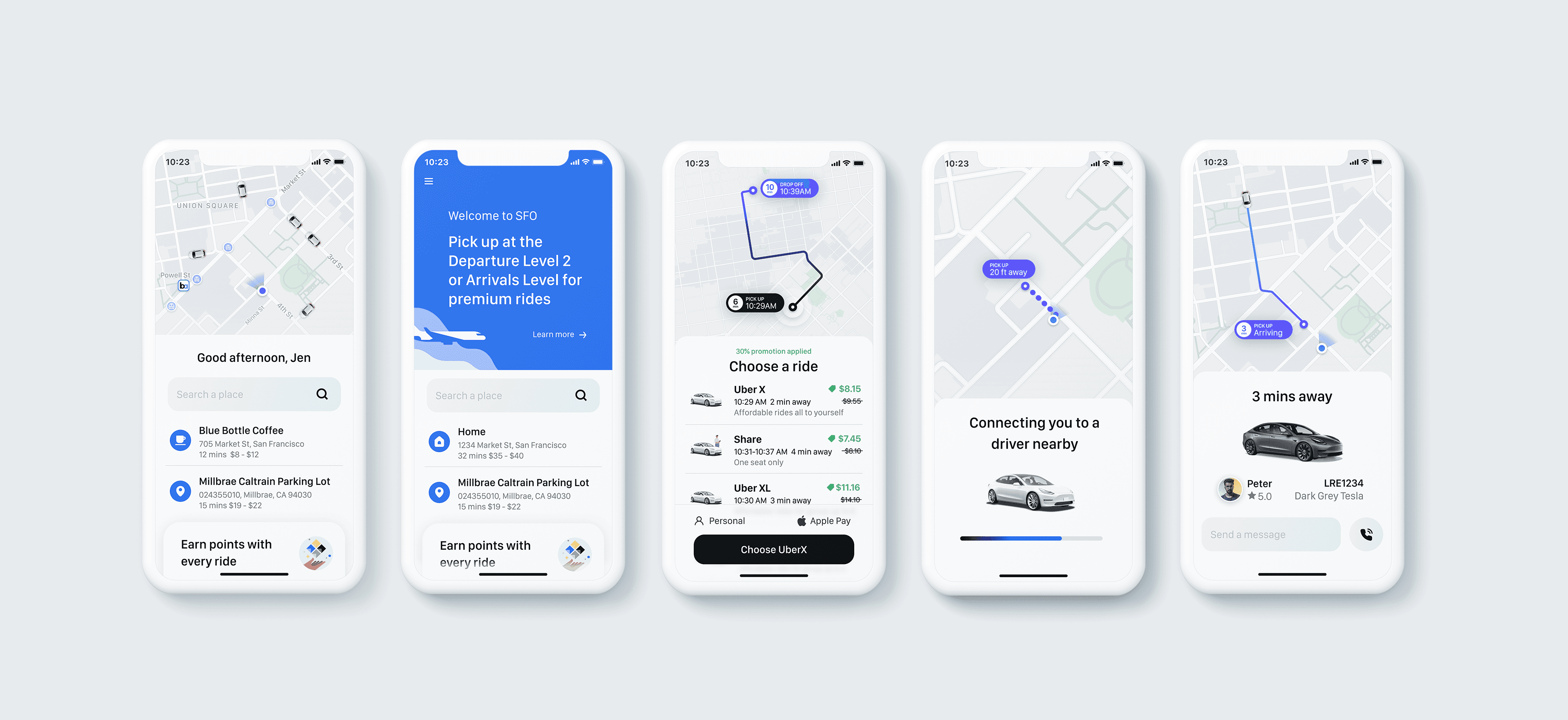
Uber Rider 2017 - 2019
After five years of building productivity-focused apps, I found Uber’s product challenges uniquely compelling. Users browse and request services through the app, but the actual experience unfolds in the physical world. Bridging that gap between digital and real-world interactions presented a fascinating challenge. What matters to users in one moment might be irrelevant the next, their context shifts quickly. Guiding them through this dynamic, end-to-end journey requires thoughtful, adaptive design.
Smarter In-App Messaging
Marketing and Sales wanted to reach users with deals, tips, and campaigns. Product aimed to guide users, prevent errors, and promote upsells - especially in high-stress moments. Like any business, the goal was to build loyalty.
The challenge? Most users ignore messages. When the app is open, their focus is speed - while Uber wants to share content that may not match immediate intent. Despite spending millions on promotions, many users didn’t even know they had offers available.
Our team created a dedicated in-app messaging channel. We aligned needs across departments, audited existing messages, and set a clear principle: messages must provide user value. We introduced a tiered system to match message types with the right in-app surfaces, ensuring relevance and minimal disruption.
Beyond Design
The Bricks 2020-2024
My UX career has taken me from Samsung and Motorola in Seoul to Google and Uber in the Bay Area. In 2019, I left big tech to work with early-stage startups - and found a new passion for building products from the ground up.
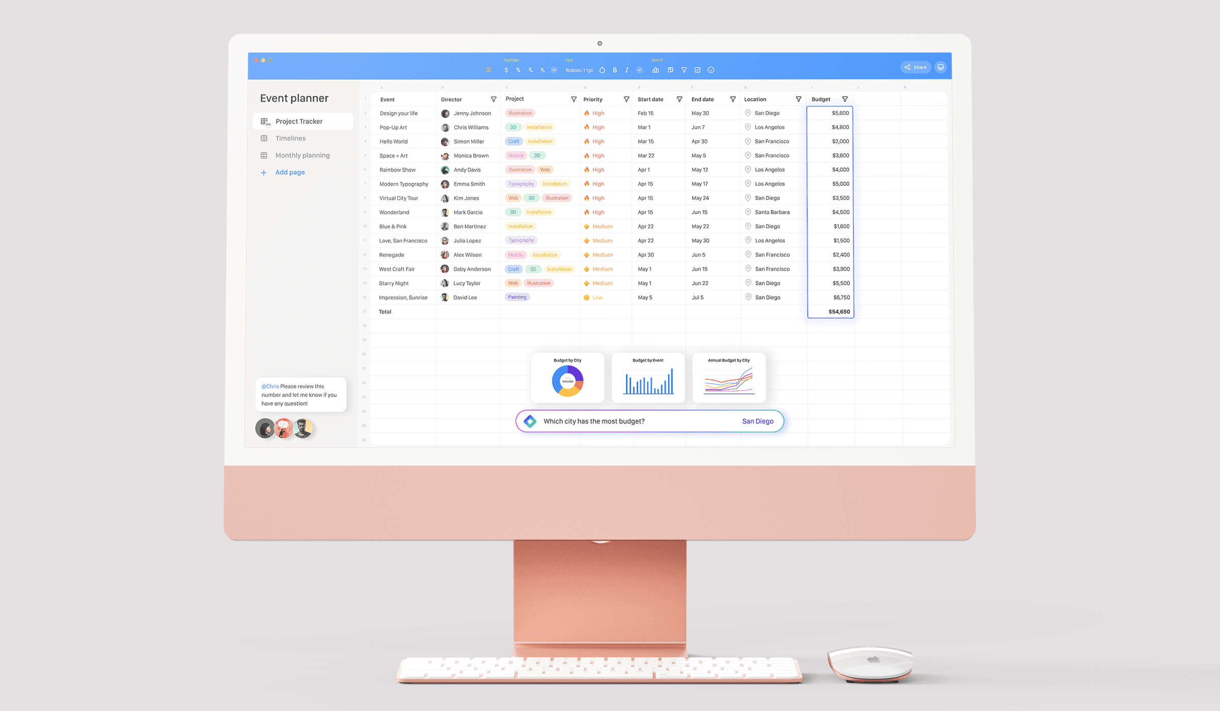
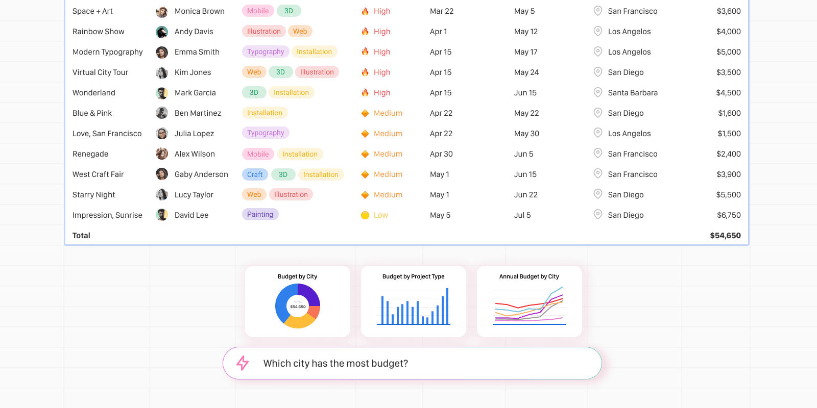
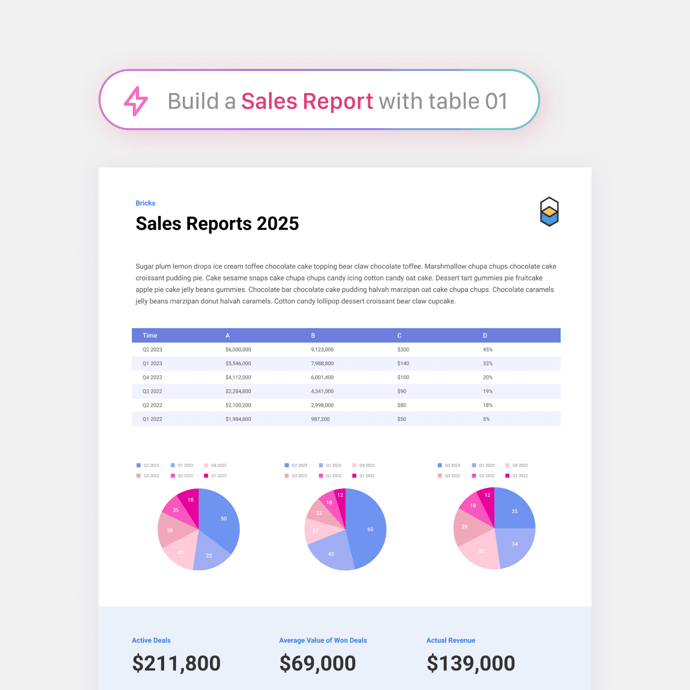
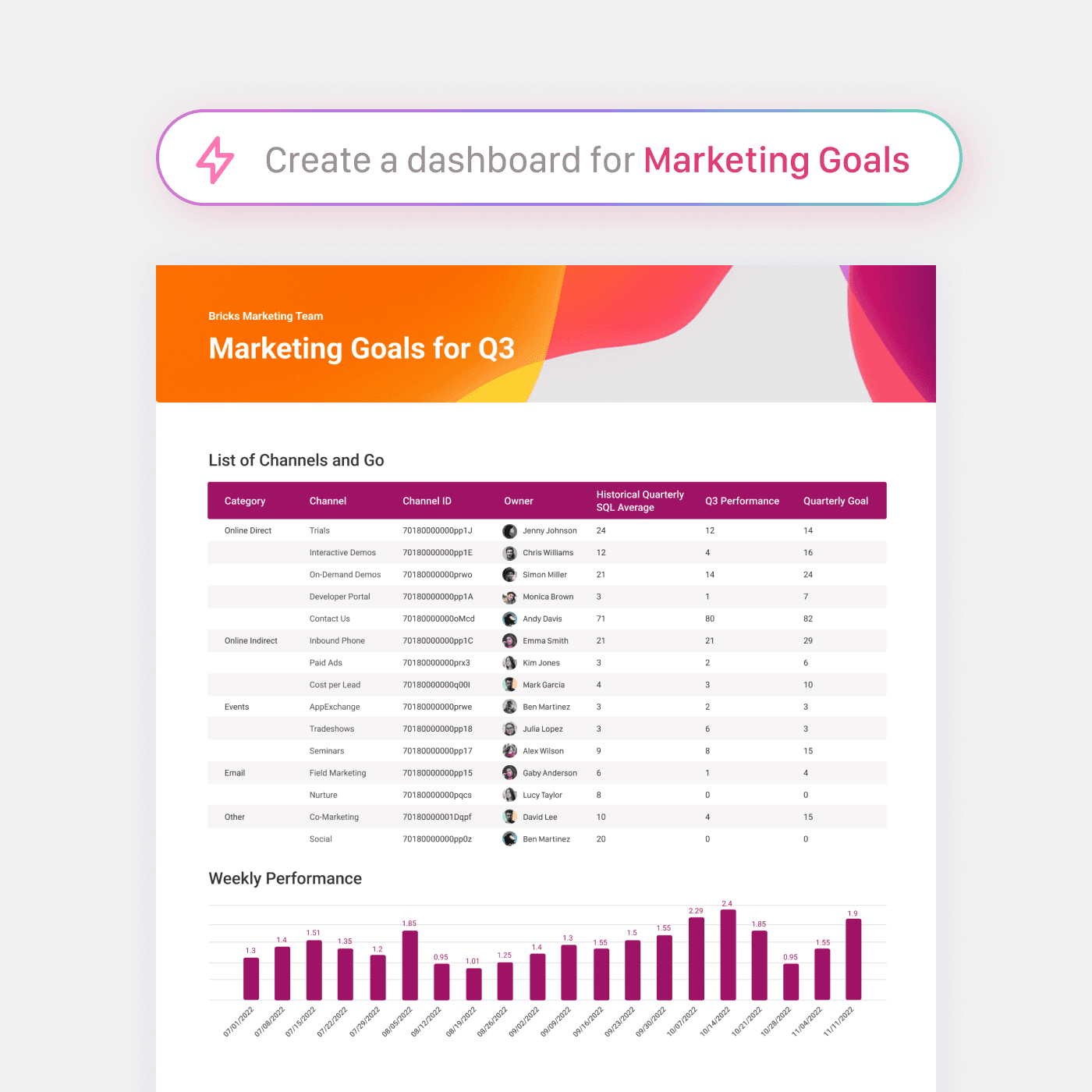
That’s how I joined Bricks as a founding designer, a team reimagining spreadsheets as a flexible, AI-powered data platform. Bricks let users transform data into dashboards, restructure tables, and generate live charts with ease.
Spreadsheets, like other document apps, serve a wide range of users - but they stand apart in purpose. Designed for handling structured data at any scale, spreadsheets help users store, track, and visualize information to uncover meaningful insights.
Unlike more mature office tools like docs or slides, the spreadsheet space is just beginning to see fresh competition from products like Airtable and Monday.com, which focus on specific use cases. In contrast, The Bricks set out to modernize spreadsheets for a broader, more general audience.
With AI, users no longer need to master formulas or complex features. They can easily build tools like mortgage calculators, long-term financial plans, or product comparisons. AI also simplifies the process of cleaning and restructuring large datasets, helping users digest information faster and extract insights with ease.
Where the Wave Breaks
Working at a startup felt like surfing a wave that never stopped crashing - wild, uncertain, and eye-opening. Coming from corporate structure, I suddenly saw everything: how decisions were made, where the money came from, what was truly at stake.
At Bricks, our small team kept returning to one big question: Why should this product exist?
Some days the path felt sharp and clear. Other days, we were just staying afloat. People liked what we built, but likes don’t pay salaries. We needed growth. Fast.
Success here wasn’t about polish, it was about learning quickly, letting go of perfection, and building what worked. Design became our anchor, keeping us close to users and guiding what truly mattered.
But the biggest shift? Realizing the heart of it all wasn’t the product, it was us. A tiny team chasing something bigger than ourselves. That belief kept us going.
After years in big tech and one wild startup ride , from Seoul to Silicon Valley. I’m now in the -1 to 0 phase of ideas I’ve been dreaming about.
If you’re passionate about building products, digital apps, or AI, or just love nerding out about design and creativity, I’d love to connect. Let’s grab a coffee at one of San Francisco’s great cafés, say hi at royshin625@gmail.com.
